- poster
NHS stop spreading diseases

- camerawork
The is no camerawork in the this poster
- mise en scene
The mise en scene of the post has a clear medical presence that is designed to inform an audience.
- font styles
The front is large and clear, this is so it is clear and easy to read from a distance or people with site problems.
- colours
The colours are simple and clear as it is promoting a serious topic and will be placed in areas that are clinical.
- Where can you access This ?
You are about the find these in doctors/hospitals, these will be found in these locations as this is where they are most needed to help stop the spreading germs.
- DVD/CD cover
Now that's what i call Disney

- camerawork
There is no camera work on the cover but there is images of characters from multiple Disney movie.
- mise en scene
The mise en scene of the album cover portrays a clear childish and fun vibe, this will attracted kids.
- font styles
Fronts styles are big and loud, there is also the Disney front this is so its instantly reconcilable to children.
- colours

- where can i access this ?
Found in shops or online, these types of graphic design will be found as they are for commercial used as they need to appeal to people but also needed to inform people of the songs on the CD.
- billboard

- camerawork
The camerawork is close up shot to a woman's face with a serious/scared expression this shows that the show is either a drama or horror and it marketed towards an older audiences
- mise en scene
The mise en scene of the billboard tells the audience that the series is has a deeper meaning and secretes will come out.
- font styles
The front is bold and clear make it look like it is weighing on her suggesting that something is either causing her stress or pressure.
- colours
The colours are dark and moody, the dark background makes it look run down while the red makes us think of blood.
- Where can i access this ?
In built up areas and on streets, this is done to inform as many people as possible about the new shows release.
- flyer

- camerawork
Their is no photos on the flyer.
- mise en scene
The mise en scene of the flyer tell the audience that this is a fun up beat event that is targeted to young adults.
- font styles
The fronts are round and fun but still easy to read so people can find the information out.
- colours
The colours are bright and fun to reflect the music of the night and the atmosphere.
- Where can i find this ?
Near the venue being handed out, this means people to where the venue is if they want to come back and the people in this area are likely to be interested in these type of events.
- merchandise
Pulp encore tour merch

- camerawork
The t shirt has no photos
- mise en scene
The mise en scene of the t shirt show the energy of the band and the type of music that they create.
- font styles
The font is the classic pulp front that appears on all of their albums.
- colours
The colours are black, magenta and white. These colour have been chosen to help thee band name stand out, the white on the back help the smaller information stand out
- Where can i find this ?
Can be bought at concert or on the bands website, this allows people to remember the day or to show their support for their favroite band.
- tickets
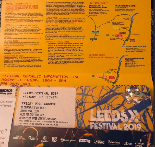
- camerawork
Their are no photos on the ticket.
- mise en scene
The mise en scene of this ticket shows the audience that the weekend in going to be exciting and busy.
- font styles
The font its worn and rugged to reflect the nature of the festival
- colours
The colours tell the audience that The festival is high energy and exciting.
- Where can i find this ?
Sent to you after you have purchased, this allows you to gain access to the festivaland also to use as a keep sake after to festival.
Game interface:
Minecraft:

- camerawork
there is no camerawork as the game has been created digitally.
- mise en scene
The mise en scene of the interface give the impressions of a childish and easy fun.
- font styles
The font imitates the brick styles of the blocks that are the base of the game.
- colours
the colours are life like to realm environment to make the game look familiar.
- Where can i find this ?
This is found as the game starts and can allow you to navigate through the different game modes.


