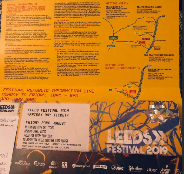
Tuesday 14 May 2024

LO3: Graphic design principles used to meet the brief

 Concert ticket

1


I chose to use tradition serif font instead of more modern sand serif to create a junxatposion to the musical style of the artis. I used mainly black and white but with red accents to follow themes of grunge. BY choosing a deep red as the accent colour this have connotations of blood and danger. I kept the text too a minute as it a ticket and doesn't need the have a wide range of information. I chose a photo of the artist leaning to create a powerful stance of the tickets. I minimised the white space by using a hand drawn background made up of small drawings that related by to the artist. I created repression with a female artist. The models goes against stereotypes because she is a female in a powerful positions rather a subordinate. This also makes her in to an idle self for other people that look up to females like her. This meets regulators standards because the images and langaer are acceptable for people of all ages and all the information and image are correct and fact checked this means they are safe from libel and copyright. 
Poster:


I used serif fonts to make all three products cohesive. I used over sized fonts to make the poster easy to read from a distance. I used a deep red to make the text to stand back of the background making easier for the poster be read from a distance. The text have the basic information like time and location so people get the necessities and can walk away with the knowledge they need to do personal research. I have used too images of the artist from the same photoshoot to keep a cohesive theme. I have kept the white space to a minimum by using the sea background as the ticket this makes to two connected. I took inspiration for the background from other riot gurrl posters that had a collage elements. Th poster has created representation through used a powerful female that can be seen as an idle partner. I have made sure to follow all the guildlines that are set by the regulators. I have done this by making should that the language and image are suitable for all ages and that it is all original to be safe from copyright. 
Album cover:


1.     


I have used the same font that the artist always uses for her name across the Bottom of the cover. for the title of the album I have used a serif font to constants the non classic style of music the artist makes. I have used a dark red to reflect the  anger and frustration that can be heard in the songs in the album. The only text on the album cover is the title and the name as the is no other information that needs to be present on the front cover as I want the image of the singer to be the focus of the cover. The photo that makes us the front cover is from the same shoot so all products look related I also chose this a cover image as it is a straigh angle shot so the model is looking straigh head at the person looking at the cover. this makes her appear incontrol and powerful which goes against stereotypes of females. There isn't any white space across the cover because the image takes up the whole front there is some black spaces but due to the powerful look of the model your eyes aren't drawn there. The album cover follows regulation guildline this is important because breaking. regulations can lead to fines. 


Friday 8 March 2024

LO2: Generating ideas


Mindmap:


After hosting a focus group I found that audiences pay most attention to an album release as this leads them to look for concert tickets and then to clothing lines to where to the concerts. this is why I have chosen to create promotional material for an album release. 


Mood-board:


This house style works well with the artist as she takes most of her inspiration from punk girl groups of the 1980s and early 90s. This is suitable for this use because this style will attract the correct audience for the artiste's music. After sending out images of my mood the audience's feedback said that overall it shows a seance of females in power as most women are going against what is expected of them. which aligns with what the artist wants to portray. 


Production plan:


Gantt chart:


Resources and personnel:


Congintce plans:
If plans have  to be cancelled to weather illness or other reason the event will be rescheduled form the following week or closest possible date. If the shoot is not possible to go ahead out doors than then the shoot will be moved to a studio where I can add in the nature elevate I want to include post-production. 

Legal and ethical considerations:

Legal:
To make sure that I do not broke any laws I will research in to the areas that I wish I want to take photos and make sure that all model have sign contract to allow me to use their image. TO protect myself from copyright laws I will make sure that all ideas used are of my own and if I wish to use anyone else's I will gain permissions.
Ethical:
To stay ethical I will allow all models and my myself breaks so not to impact on our health this will include considerations for food and water. I will also not be using animals so don't need to take into account for them. 


Monday 26 February 2024

LO1: Analysis of existing graphic design (regulators)

 Include an example of banned graphics/ advert by one the above regulators to support your explanations

Regulators are the bodies that set standards and rule for each industry sectors have to follow, if rules are broken they if mean the  company responsible for this will have to pay fines.

The regulators are: 

IPSO:

IPSO,Independent Press Standards Organisation are an independent regulator for the newspaper and magazine industry in the UK. they hold newspapers and magazines accountable for their actions, protect individual rights, uphold high standards of journalism and help to maintain freedom of expression for the press.


ASA:

ASA, Advertising standards authority are responsible for making sure that advertisement stick to they rules, and if not then resolve  the  issues.   


BBFC: 

BBFC, British Board of Film Classification is a non-governmental organisation  and responsible for the national classification and censorship of films exhibited at cinemas and video works released on physical media within the United Kingdom.


OFcom:

OFcom, The Office of Communications is the communications regulator in the UK. they regulate the TV, radio and video on demand sectors, fixed line telecoms, mobiles, postal services, plus the airwaves over which wireless devices operate.

An example of a product that was banned by a regulator is

has been a key theme for the Advertising Standards Authority (ASA) this year, with the ASA banning an SUV advert on environmental grounds for the first time in a landmark decision last month.


The ASA has banned two Toyota adverts for condoning driving that disregards its environmental impact in a landmark ruling, stating that the SUV ads had been created without “a sense of responsibility to society”.This was the first time the Advertising Standards Authority has banned an SUV advert on the grounds of breaching social responsibility in an environmental context.

First released in 2020 the poster and video shown on social media, showed a large number of  Toyota Hilux  drive driving through forests and through rivers , while a voiceover describes the scene as “one of nature’s true spectacles”. The vehicles then join a road and drive through a city before a car enters a drive, with the VoiceOver saying “Toyota Hilux. Born to roam.” The poster shows two SUVs in the foreground, followed by others traversing a rocky ground making over a cloud of dust. 


BBFC:


Hate crime was banned in 2012 by BBFC Due to A focuses on the terrorisation, mutilation, physical and sexual abuse and murder of the members of a Jewish family by the Neo Nazi thugs who invade their home. The BBFC Said that "would be inconsistent with the Board's Guidelines, would risk potential harm, and would be unacceptable to broad public opinion".


OFCOM:


Ofcom banned the RT channel as it was backed by Russia and there were claims that it was reporting fake news on what was happening in Ukraine. This goes against Ofcom's guide which states "synthetic media could be used to create fake news, propaganda and other forms of disinformation that can spread quickly online leading to challenges for broadcast journalists in authenticating footage from online sources". This led to their channel being taken down perminaly. 

IPSO:


Jeremy Clarkson's article breached Ofcom guidelines this lead to Ipso demanding the article was taken down and issuing an apology. Jeremy Clarkson was in breach of the the editors codes of practice and press regulations. 


Friday 22 September 2023

LO1: Analysis of existing graphic design products

  • poster
NHS stop spreading diseases

  • camerawork
The is no camerawork in the this poster
  • mise en scene
The mise en scene of the post has a clear medical presence that is designed to inform an audience. 
  • font styles
The front is large and clear, this is so it is clear and easy to read from a distance or people with site problems.
  • colours 
The colours are simple and clear as it is promoting a serious topic and will be placed in areas that are clinical.

  • Where can you access This ?

You are about the find these in doctors/hospitals, these will be found in these locations as this is where they are most needed to help stop the spreading germs. 


  • DVD/CD cover

Now that's what i call Disney

  • camerawork
There is no camera work on the cover but there is images of characters from multiple Disney movie. 
  • mise en scene
The mise en scene of the album cover portrays a clear childish and fun vibe, this will attracted kids. 
  • font styles
Fronts styles are big and loud, there is also the Disney front this is so its instantly reconcilable to children.
  • colours 
 The colours are bright and loud to reflect the song on the album. the colours are also not target towards girls or boys so it will able to everyone.

  • where can i access this ?
Found in shops or online, these types of graphic design will be found as they are for commercial used as they need to appeal to people but also needed to inform people of the songs on the CD. 

  • billboard
Vigil new BBC Drama

  • camerawork
The camerawork is close up shot to a woman's face with a serious/scared expression this shows that the show is either a drama or horror and it marketed towards an older audiences 
  • mise en scene
The mise en scene of the billboard  tells the audience that the series is has a deeper meaning and secretes will come out. 
  • font styles
The front is bold and clear make it look like it is weighing on her suggesting that something is either causing her stress or pressure. 
  • colours 
The colours are dark and moody, the dark background makes it look run down while the red makes us think of blood. 

  • Where can i access this ?
In built up areas and on streets, this is done to inform as many people as possible about the new shows release.  
  • flyer
 Leadmill club night

  • camerawork
Their is no photos on the flyer.
  • mise en scene
The mise en scene of the flyer tell the audience that this is a fun up beat event that is targeted to young adults. 
  • font styles
The fronts are round and fun but still easy to read so people can find the information out. 
  • colours 
The colours are bright and fun to reflect the music of the night and the atmosphere.  

  • Where can i find this ?
Near the venue being handed out, this means people to where the venue is if they want to come back and the people in this area are likely to be interested in these type of events. 
  • merchandise
Pulp encore tour merch
  • camerawork
The t shirt has no photos  
  • mise en scene
The mise en scene of the t shirt show the energy of the band and the type of music that they create. 
  • font styles
The font is the classic pulp front that appears on all of their albums. 
  • colours
The colours are black, magenta and white. These colour have been chosen to help thee band name stand out, the white on the back help  the smaller information stand out 

  • Where can i find this ?

Can be bought at concert or on the bands website, this allows people to remember the day or to show their support for their favroite band. 
  • tickets
Leeds festival ticket


  • camerawork
Their are no photos on the ticket. 
  • mise en scene
The mise en scene of this ticket shows the audience that the weekend in going to be exciting and busy. 
  • font styles
The font its worn and rugged to reflect the nature of the festival 
  • colours 
The colours tell the audience that The festival is high energy and exciting.
  • Where can i find this ? 
Sent to you after you have purchased, this allows you to gain access to the festivaland also to use as a keep sake after to festival. 


Game interface: 

Minecraft:

  • camerawork
there is no camerawork as the game has been created digitally. 
  • mise en scene
The mise en scene of the interface give the impressions of a childish and easy fun. 
  • font styles
The font imitates the brick styles of the blocks that are the base of the game.
  • colours 
the colours are life like to realm environment to make the game look familiar.  
  • Where can i find this ? 
This is found as the game starts and can allow you to navigate through the different game modes. 

LO3: Graphic design principles used to meet the brief

  Concert ticket 1 I chose to use tradition serif font instead of more modern sand serif to create a junxatposion to the musical style of th...